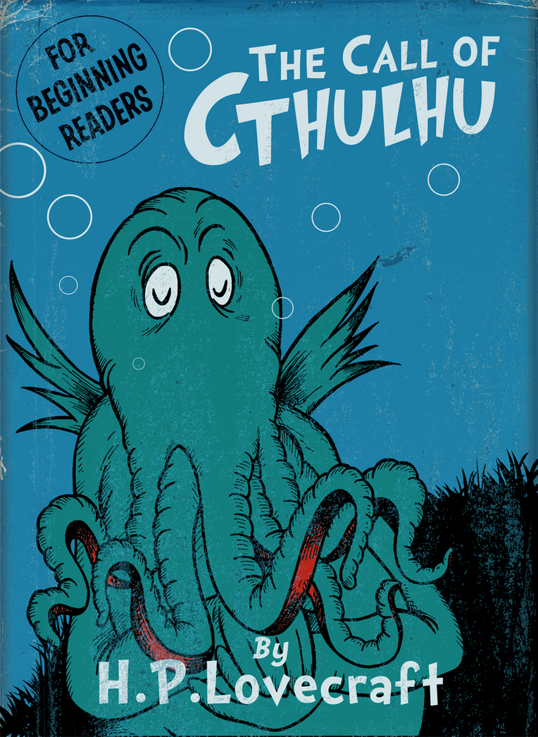
The incredibly clever Cory Doctorow, whose novels are eagerly-awaited happies for me, posted on boingboing about this perfect-for-the-holiday mash-up from DeviantArt's DrFaustusAU that successfully captures the feel of both HPL's authorial voice + Dr. Seuss' zany art-chitecture... somehow.
Read the whole damn'd thing online at deviantart.com, starting here.
Showing posts with label h.p. lovecraft. Show all posts
10.10.2011
10.08.2010
"The Dunwich Horror" by HPL and Alberto Breccia
"The Dunwich Horror" is one of H.P. Lovecraft's best-known short stories, one that highlights the horrific Whateley family tree with illuminating results. A film adaptation starring Dean Stockwell was released in 1969???, but doesn't quite live up to the source material.
Though you gotta love the nod to Aleister Crowley seen here:
Our page's Crowley pic features the same pose (can't see Dean's thumbs, though)! Victorian-era Dr. Venture + the gang shoulda never thrown him outta that Zeppelin...
That being said, though, it is still an entertaining flick, even though the other brother looks like one of those gas-cloud aliens filld with sparkly lights from the original Star Trek series... Visually representing Cthulhu or that other Whateley or Yog-Sothoth is gonna be tough, for sure. HPL certainly roadbumpt his future would-be artistic adaptors, as he tended to use some inventive maddened gibberish to allow the reader to create a mental picture from the rather vivid but bizarre descriptions given by the story's characters, thus ensuring that a concrete image will, by necessity, not live up to the horrors the human mind can craft:
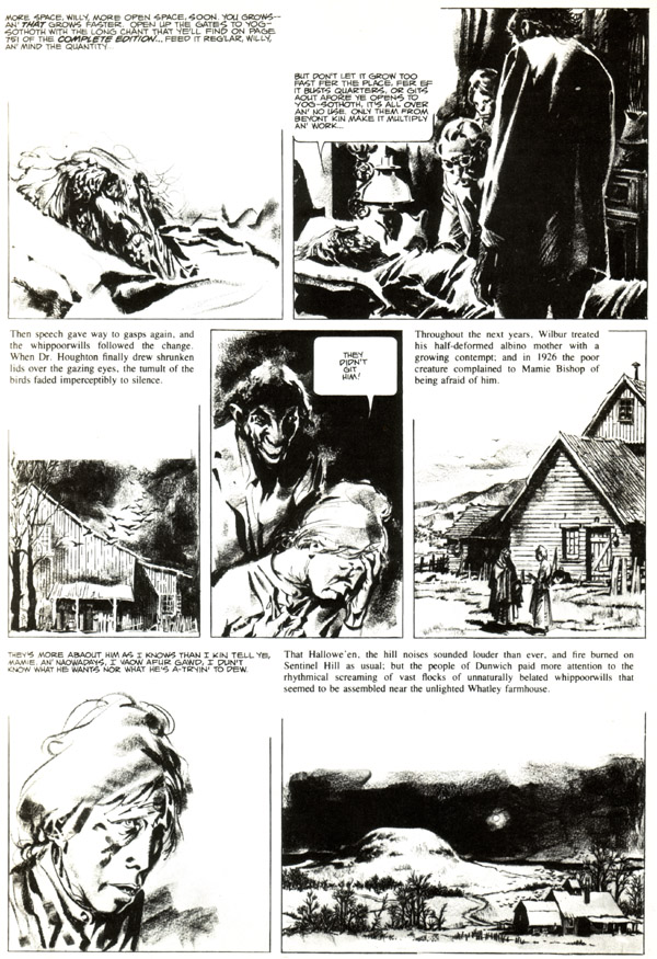
But I think that Alberto Breccia nailed it... His adaptation relies heavily on the stark whites + blacks on the pages. Particularly, the white negative spaces that drape many pages create a bleak storyscape, shit-tons of fog, the horizon + much of the background undiscernable... And the characters, drawn in grayscale, suggesting their human complexities/frailties + highlighting their craggy features are incredible-looking. When we finally meet Wilbur's brother, we get a good look - and the change in panel size creates a 'bum-BUM' kinda moment - but even that panel seems slightly out of focus, maintaining a degree of unknowable otherworldiness. Ver' nice...
So, without much further ado, here is Alberto Breccia's adaptation from 1974, scannd here from the October, 1979 (All HPL!!!) issue of H3-@VY M-3+@7 (just avoiding the sue-bots, y'all, not trying to be web-clever or nothin') of H.P. Lovecraft's incredible "The Dunwich Horror"... :
![]() |
| "Yogggggg-Sothoth!!!" |
That being said, though, it is still an entertaining flick, even though the other brother looks like one of those gas-cloud aliens filld with sparkly lights from the original Star Trek series... Visually representing Cthulhu or that other Whateley or Yog-Sothoth is gonna be tough, for sure. HPL certainly roadbumpt his future would-be artistic adaptors, as he tended to use some inventive maddened gibberish to allow the reader to create a mental picture from the rather vivid but bizarre descriptions given by the story's characters, thus ensuring that a concrete image will, by necessity, not live up to the horrors the human mind can craft:
"Bigger'n a barn... all made o' squirmin' ropes... hull thing sort o'shaped like a hen's egg bigger'n anything with dozens o' legs like hogsheads that haff shut up when they step... nothin' solid abaout it - all like jelly, an' made o' sep'rit wrigglin' ropes pushed clost together... great bulgin' eyes all over it... ten or twenty maouths or trunks a-stickin' aout all along the sides, big as stovepipes, an' all tossin' an' openin' an' shuttin'... all grey, with kinder blue or purple rings... an' Gawd in Heaven - that haff face on top!..."
-"The Dunwich Horror" by HPL (The crazed babblings of poor ol' Curtis,upon first seeing the other Whateley brother )
But I think that Alberto Breccia nailed it... His adaptation relies heavily on the stark whites + blacks on the pages. Particularly, the white negative spaces that drape many pages create a bleak storyscape, shit-tons of fog, the horizon + much of the background undiscernable... And the characters, drawn in grayscale, suggesting their human complexities/frailties + highlighting their craggy features are incredible-looking. When we finally meet Wilbur's brother, we get a good look - and the change in panel size creates a 'bum-BUM' kinda moment - but even that panel seems slightly out of focus, maintaining a degree of unknowable otherworldiness. Ver' nice...
Subscribe to:
Posts (Atom)